5 Days 'til Block'd

Block’d is just 5 short days away, I can hardly believe it! In today’s post, we’ll be talking about the overall aesthetics and art that went into Block’d.

Let me tell you, the meh, the bad and the ugly sums up how development for the aesthetic went, and to be perfectly honest, I’m still not 100% happy with it.

I am by no means an artist. Sometimes I manage to pull off some decent stuff, but I just could not wrap my head around what I wanted Block’d to look like. I believe that anybody could agree, you need a starting point, so I looked to some of the popular puzzle/strategy games at the time. 2048 and Threes are the two that I want to talk about, since they are so similar in play style, but so different in aesthetics. Both are massively popular and successful due to their easy to learn, difficult to master play styles, which I felt like summed up Block’d as well. However, look at their aesthetics:

2048

Threes

2048 is all simple tiles, whereas threes has some unique little adorable faces. Two ends of the spectrum, which was I to choose? Due to my limitations, I went with the simplistic approach. But it took a while to get there:

Eventually it got to a point that I was at least moderately happy with, and from there, it was just a matter of creating an overall feel that went with the design for the game screen. All the buttons, all the in between screen followed the same basic patterns and colors. In the end, I feel like we created a very cohesive game, even if the art is not the best. Seeing it live, and on my phone, I frequently find lithe things that I would be happy to change, and that I will over time. But hey, that’s what updates are for.

Hope you enjoyed this! See you in 5 days!

Austin

6 Days 'til Block'd

Today marks the sixth day until block’d is released and today’s post is part 2 of the level design process post.  If you haven’t read part 1 yet make sure to go do that because this literally wont make any sense if you haven’t read that.  Like seriously, even if you did read it yesterday (thank you again) you might want to go refresh yourself real quick.  Okay.  Remember where we left off?  Alright, well with out further delay here is part 2 of the level design process post   

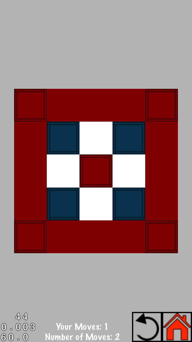
In addition to this new way of creating levels, I also took into consideration the effects of having multiple start tiles touching each other.  Say, for example, you have three start tiles in a reverse L shape and you touch the bottom left one.  Theoretically they all start at the same time so does the bottom left one block the top right one and continue to move upwards, or does the top right one block the bottom left from moving up and continue to move to the left?  These kinds of observations about how we had programmed the game added more and more difficulty to each level.

After having a few level builds under my belt it was time to add a new dimension to the game in the form of the tap counter.  Some of the levels were almost impossible to loose, if you could tap all the tiles; so it was time to limit the number of taps.  For the most part this wasn’t a difficult job as the level designer.  However, there were some levels I thought would take eight moves, but only ended up taking six.  And Austin found a way to cut the moves down on another level by about half.  While adding the move limit did increase the difficulty (one of the beta testers was often frustrated by being one move over on more than a few levels) there was still one last feature of the game that could be exploited to add the final layer of difficulty.

Timing.  For the purpose of this game timing is defined as touching a start tile before the previous start tile has finished expanding.  Timing was the final step in making levels that couldn’t be beaten easily.  With this new challenge some tiles would have to be tapped while others were still expanding to ensure that one tile’s path got to the corner, or to make sure that another tile’s path was blocked.  The idea for timing in our game was really just a side effect of the way the game was programmed.  The tiles expanded at a given rate and nothing stopped you from tapping another tile before the first one had stopped.  I can’t remember the exact moment we discovered this, I think it was early on while we were still working on level zero, but I do remember thinking it was going to make the levels extremely challenging.  Additionally it made the level design a little more challenging.  

The main difficulty with designing timing levels was that I wouldn’t always get the timing right when I was drawing the levels on paper.  At this point in the level design process I was still starting with one tile (or maybe a group of tiles) but I would then say “oh wait, what if a blue tile were to come in and block this path off” and then add a blue tile that would need to be tapped before the yellow tile’s path reached it.  The level design process for these later levels is actually very similar to the previous design processes, just being conscious of the timing effect and using it to increase the difficulty.  However, sometimes I wouldn’t quite get the timing right and I would end up with a level that wasn’t necessarily impossible, but was rather different from what I had originally intended.

With this last game mechanic exploited in the level design process I began creating the final, most difficult levels on larger, more difficult boards.  The level design for block’d will continue to evolve as we introduce new groups with new tiles with new mechanics to keep the game fun and puzzling.


Anyway. . .  block’d comes out July 7th for iOS devices.  We’ve worked really hard on this and we hope you’ll enjoy it as much as we do.  Keep checking back here for our daily block’d count down and make sure to download block’d on July 7th from the App Store.


As always, thanks for reading

-Matt.
7 Days 'til Block'd

It’s only seven more days until the release of block’d and today I’m going to talk a little bit about the level design process.  But first, if you haven’t already, make sure to catch up on yesterday’s post here.  block’d was basically born through the process of coming up with levels and deciding whether or not it would make a good game.  Some of the first levels (which didn’t actually make it into the final game) were crude sketches in the margins of class notes.  The level design process, like all the other processes during development, evolved, creating new and different levels with different approaches for how to beat them.

Like I said before, the first levels were sketched out in the margin of my notes trying to decide if the basic concept for the game would be puzzling and enjoyable.  I originally started out thinking that we would have a single grid size designed to match the dimensions of the iPhone screen so I started with the five by eight grid.  The first levels were basically built one tile at a time, sketching its location and the path it would take upon expansion.  Then a second tile would be placed, and a third tile (some in the path of others to achieve the chain reaction effect), until the tiles and all their inevitable paths would fill the board.  With this technique, levels were built that gave us an idea of what the game could be, and from there we were off and running.  However there were some flaws in this technique that needed patching.

Austin was playing one of the levels I had drawn out on paper.  Not only did he beat the level quite easily, but he also did it in less moves than I had originally thought it was going to take (this is another point of evolution that we came to a little later on in the process).  It was clear that the level design process was going to take a little more thought if the levels were going to be challenging.  To do this, I started thinking about ways in which the paths could intersect such that if one tile was tapped first, its path would block off a portion of the board causing the player to loose the level.  This created a linear way in which the player must make their moves in order to make sure no part of the board is blocked (incase you were wondering, this is where the name comes from.  Credit to Austin for being clever.  Up until then we were just calling it Tile Puzzle, which didn’t have the same kind of ring.  Anyway).  With this new way of thinking about things there turned out to be only one way to solve some of the levels. . .


So this actually turned out to be a much, much, much longer post then I had originally intended so I decided to break it up into a part 1 and part 2.  I hope you enjoyed part 1 and make sure to check back tomorrow for part 2!


As always, thanks for reading

-Matt.

8 Days 'til Block'd

Well, I'm apparently bad at timeliness, but what's important is it's still the 8th day for me, right? If you haven't already, make sure to check out day 1 and day 2 of this series!

Today I'm going to talk about the first programming step. After laying out the basic idea of a puzzle game with cascading tiles, we were able to determine what the first steps of programming this new game were.

  • A grid.
    • Obviously the core element of Block'd is the grid that you play on, looking at the game as it stands now, it might not seem that fancy. However, the logic and infrastructure behind the grid would allow it to support any reasonable sized grid, with auto-scaling. 
    • Fun fact: the splash screen you will see at the beginning of the game is actually built with our Grid Builder class.

The grid is the entire basis of Block'd. What tiles go where, how big of a board you're playing on, which tiles can move in which direction so on, so forth. So naturally, we had to nail it. While it was one of the first things we implemented, it was also one of the things we did the most iterations on.

IF I were doing a proper dev blog like we should have been doing, I would have many screenshots of the various iterations to show you right now. Unfortunately, I was not that cool, and I will have to do my best to describe.

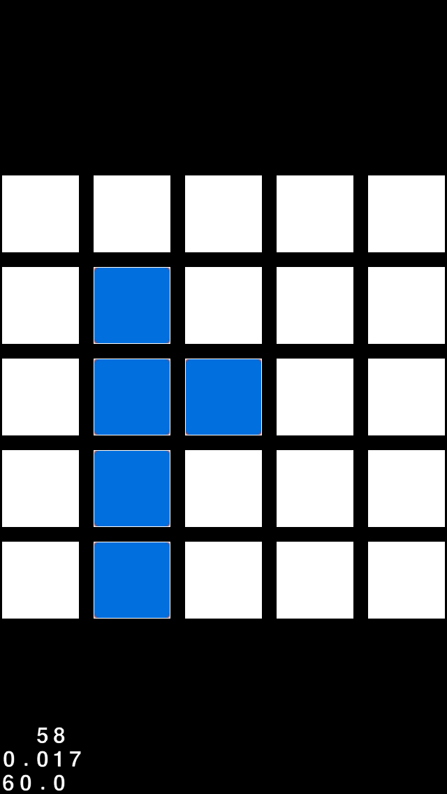
a 5x5 grid from Block'd

To the left you can see the grid in its final state. There is no padding between tiles, the tiles are white, and when it animates (as shown in the teasers) it appears seamless. 

It was not always that way. The first iteration actually had padding in-between it all creating a spacing. We moved away from that idea because it created a weird graphical feel that we were not 100% comfortable with, it did not flow as smoothly as we envisioned.

One of our next iterations had different colored empty tiles, like a grey. That was scratched quickly, and evolved into what happens if we make the empty tiles a smaller size against a different background. I was actually oddly fond of that idea, but again, was not what we were looking for, and we moved back to the original thought of padding.

Programmatically we were oddly attached to padding, mainly because it was a nifty bit of code that got the auto-resizing to work with dynamic padding as well. It was my brother who suggested we move away from the padding. Matt took a bit of time to get accustomed to it, but I think he's grown to like it where it is now.

I hope you enjoyed this little look into our iterative design process. We can't wait to bring you more! 


Austin

7 Days 'til Block'd

9 Days 'til Block'd - The Inspiration

We're now down to only nine short days until the release of block'd for iPhone and iPod touch.  For today's count down post I'm going to give you guys a little insight into the inspiration behind the game. (Also, if you haven't read the day 10 count down you should go do that now and then come back)

Honestly the main inspiration for this game really came from a need.  We had just finished our first game, ColorGuess, and we were onto the next one.  However, we were having some trouble finding an idea for our next game that would fit our learning curve.  With both of us in school full time and dealing with part time jobs it wasn't always easy to find time to learn all the skills we needed in the amount of time we had.  With all of those factors influencing the direction for our next game a puzzle game just kinda seemed to fit into all of those criteria.  It seemed simple enough, not requiring too much animation or in-depth artwork, and only needing a simple game engine.  Additionally, it seemed like a logical next step in our learning curve to help us become more aquatinted with more advanced programming techniques for our future games.

The other source of inspiration for block'd came from the games we were playing at a time.  The main games that gave me inspiration for block'd were Color Zen and KAMI, both of which are puzzle games that, coincidentally, have the same end goal of filling the playing area with a single color.  The main thing I remember while playing Color Zen was the simple concept of the game accompanied by the complexity of the gameplay.  It kinda got me thinking about how a developer would come up with a concept for a puzzle game.  What the end goal would be, what the game mechanics would be, and how both of them would fit together to give people a challenge.  While Color Zen really got me thinking about the basic concepts of a puzzle game, KAMI really drove it home.  KAMI really helped me put the finishing touches on my basic idea for block'd.  But again, the inspiration for block'd really came from the contrast of simple goals but complex mechanics that both these games have.

Once I had the basic idea down I started making some simple levels to see if the idea for the game was even interesting.  I told Austin about the game and that I had a couple of levels I had made that I wanted him to look over, but before I had a chance to give them to him he had already started the programming. . .


Thanks for reading and make sure to come back tomorrow to read about the begging programming for block'd