Two Days Until Zen Balance!! -- The Art

We are super close to the release of Zen Balance this Friday and for today’s “count-down-to-Zen-Balance” post I figured I would talk about the art.  If you haven’t read yesterdays post about the development process go check that out here

Art, for us, has always been a bit of a struggle.  Neither Austin, nor I, are really artists and we don’t have the capital (yet) to go out and hire one.  For the most part, we’ve been able to get through with our limited abilities and with some added help from some people who have graciously donated some of their time for us.  Zen Balance was no exception to these difficulties.  We probably spent a good three or four meetings just talking about what we wanted the game to look like and how we would go about implementing it (given our aforementioned lack of skills in the art department).  When we were in the first stages of development we were using just simple colors for our circles.  If you’ve been following our development process then you may have seen some of those images (They looking like this:). 

But we knew we would have to up the aesthetic a little bit to have a game that looked half way decent.  At first, we had the idea of doing some kind of “textured” circles to just add a little bit of artistic appeal.  This is was sort of a first draft:

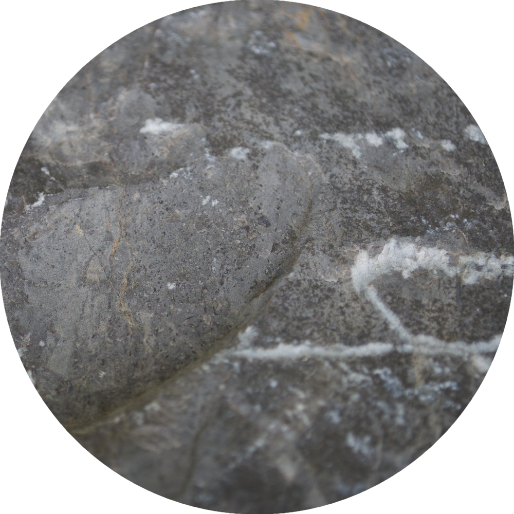
This idea didn’t last long at all and was quickly scrapped.  But it did give us the idea of doing some kind of “cartoonish” style patterning for the game.  But before we could move forward with that idea we had a second one.  What if we did the art using real pictures?  While I'm not much of a hand drawn artist I am a bit of a photographer; and with all the games using 8-bit style art we figured a photo-reaslitic approach would set us apart, for better or worse.  The idea had come up in previous brain storming sessions for other games and at this point we were stuck on the art and needed something to, at the very least, try.  So with that, I busted our my camera and started taking some macro photos of grass, wood, rock, and water.  These are all of the final element circle images in the game:  

The pictures for the element circles came to gather rather quickly, the background picture however. . . took a little more time.  We went through a few iterations before we found something we actually liked.  Here are a few of the backgrounds we decided to pass on.

Here's a fun little fact about the background in the final game.  While the final background looks a lot like sand, and is a real picture, it is not, in fact, a picture of sand.  It’s actually a picture of the milky way!

It turns out that if you invert the colors of a black and white picture of the milky way, add a little sepia tone for that sandy color, you end up with something that looks a lot like sand.  So there’s a fun little secret about the art in Zen Balance that you probably didn’t know before.  And I think that’s a good place to end the post.  Tomorrow we will be releasing the official trailer for Zen Balance so make sure to check back for that!

And, As Always, Thanks For Reading,

-Matt.
Three Days Until Zen Balance!!


We are super excited to announce that Zen Balance for iOS will be released this Friday, November 27, in the App Store!!!


(If you don’t know what Zen Balance is you can read more about it in our official announcement post here, and you can read our previous development blog posts about the game here)

So, to kick off our count down to release, today's blog post will be about the development process that went into Zen Balance.  Looking back on all the work we did for this game, the one thing that stands out the most is the development environment we used.  Zen Balance is the first game we've developed using Unity3D.  Before we even had the basic idea for Zen Balance we knew that we wanted to start developing in Unity because of its ability to allow us to make more robust games, but we weren't quite sure where to start.  We needed a project that we could feasibly accomplish in a shorter amount of time, but also something that would show us around Unity and give us a good introduction to the software.  Zen Balance turned out to be the perfect introductory project for us.  There wasn't a whole lot of difficult programming or in-depth class building that went into this game.  With block'd! we had had to build a ton of classes and methods that ran mostly in the background, but with Zen Balance most of the code translates directly to action on the screen.  With this game we were able to spend less time worrying about making our code work and more time just figuring out how to simply make a game in Unity.  Most of the issues we ran into during development had to do with figuring out how to accomplish a task in Unity (ignoring the issues we had with code signing and provisioning profiles, but that’s a whole other story).  So, for the most part, the development of this game was really us learning a new environment, and less actual code development; but again, that was kind of the point.  We knew we were going to want to make larger games in the future and we would need a stronger platform to do so, but we didn't really want to jump into a large scale game with a completely new development environment.  Zen Balance turned out to be the prefect learning tool for us, giving us a good hands on tutorial of Unity and allowing us to feel comfortable tackling a larger game project in Unity further down the road (hint hint).

For the sake of keeping the post short there’s really not much more to say.  Honestly, this game was more of a hands on introduction to Unity for us, so there’s not a whole lot of interesting coding that went into the game.  But none the less, we are still thrilled with the game and can’t wait for you guys to play it!

Tomorrow we will be talking about the art that went into Zen Balance, which is actually a little more of an interesting topic so be sure to check back for that.  And of course, don’t forget to download Zen Balance when it comes out this Friday!!

As always, thanks for reading,

-Matt.

Zen Balance Has Been Submitted!!

So. . . It's been a little while since we've posted something here, but that doesn't mean we haven't been working.  (We just haven't had a lot to talk about in terms of the work we were doing).  But now, we are officially done with Zen Balance!  YEA!!!!  We have officially submitted version 1.0 to the App Store for review!  Look, here's proof!

It doesn't say Zen Balance. . . but just take our word for it

It doesn't say Zen Balance. . . but just take our word for it

If you don't know, this still means a little bit of a waiting process before Zen Balance is out in the App Store, even if our app has no issues(and we don't anticipate that it will).  So in-between now and release we will be posting about some of the development process for Zen Balance, so be sure to check back for those updates; as well as an official release date for Zen Balance.  We are super excited about having a finished product and we can't wait for you guys to check it out.

Thanks for reading,

-Matt.

September 26, 2015 -- Weekly Update

Hey all, it's about time we started posting with regularity. So, we are starting a weekly update post to inform you of what has been happening with Zen Balance this week!

This was a bit of an uneventful week for feature adding, but what we did add are huge improvements. We implemented Unity Ads into our humble little game, and got them working to our specifications, (a post about our ad theory, and monetization of Zen Balance will be coming next week,) and we fiddled with a couple of the animations in the game, (specifically the game end animation.)

Remember to check out our video post to see what Zen Balance is starting to look like as we enter the final phases of development. If you have any questions, comments, or concerns, drop us a line in the comments below, and look to us next week for a formalized release date!

Thanks for reading, as always,

austin

Zen Balance Videos

Hey all, I wanted to take a quick second to make a post of all the videos that Matt and I have shared back and forth while working on Zen Balance. Check out the videos before, or just check out the playlist on YouTube.

September 25, 2015

What will most likely be the end game animation moving forward. Yay gravity!

Just a short preview of our current game over menu. This will probably go through some iterations.

September 21, 2015

A short video showing off our redesigned main menu for Zen Balance.

September 17, 2015

One of our main menu candidates that we decided against, think differently? Let us know! 

Ooops!

One of our main menu candidates that we decided against. Think differently? Let us know.

Jus the slide in of the main menu.

A short clip of the count in animation.

A short preview of our first draft of the Game Over popup.

A quick preview of our working main menu animation.